Starting as a new media interactive company in 2013, Blinkware has grown into an international powerhouse in optical solutions through creative software and hardware integration. As the business scaled, the company went for a rebrand. I was tasked to create a new look for the company's website and volunteered to build it. I was given full project ownership with minimal supervision from planning to launch.
Throughout the years, Blinkware's products have scaled beyond interactive technologies. They need an up-to-date website with a professional appearance and create business trust among its potential clients.
How might we communicate Blinkware's multiple value propositions to its new and existing clients?
02. Objectives
Facilitates positive user experience through informative and relevant content.
Develops a coherent design language that aligns with the new logo as there was no proper brand guideline or style guide established for the website design to adhere to.
03. Sitemap and Wireframing
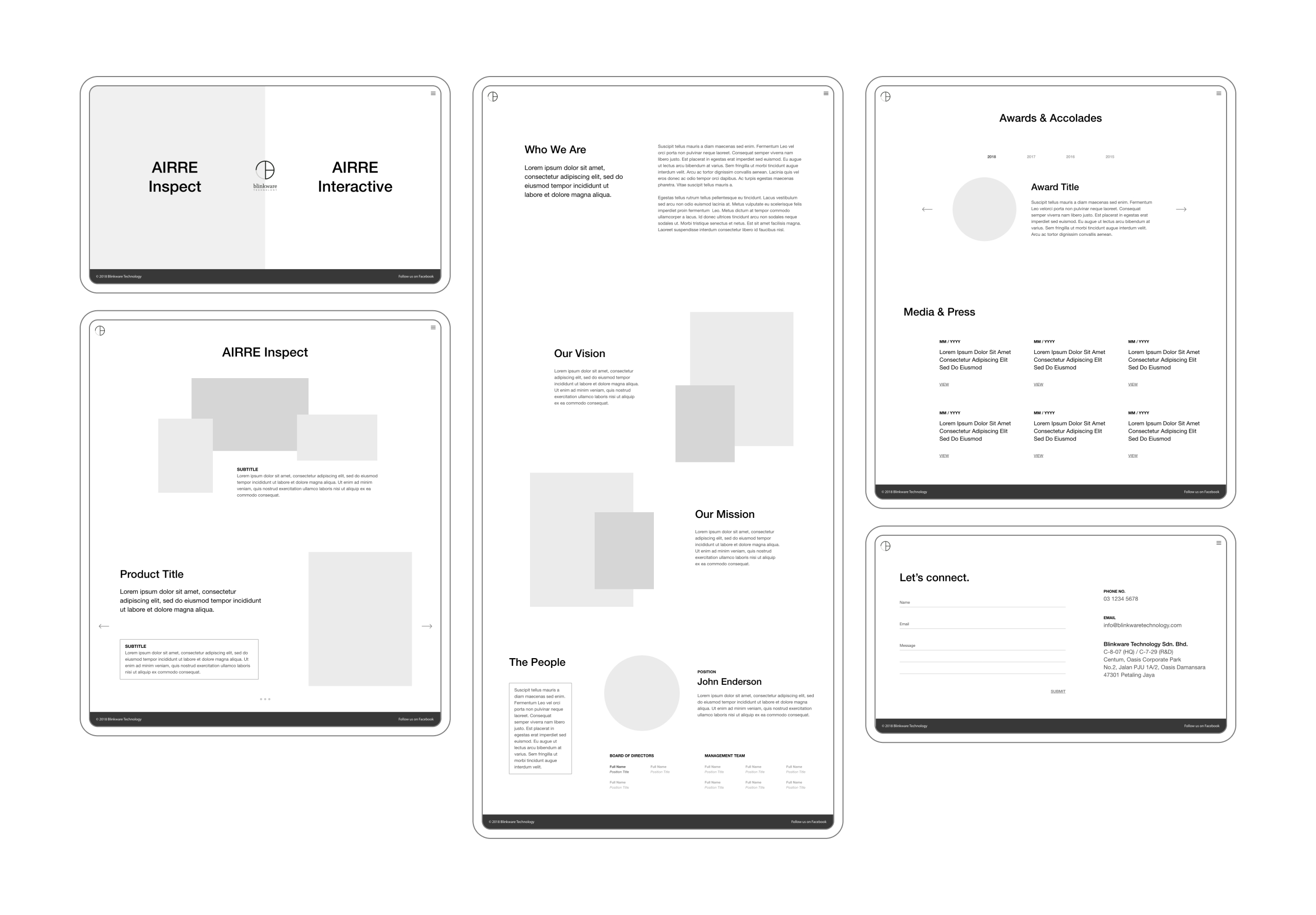
I first created a list of necessary information elements on all the pages. Having it sorted out, I continue to build on the site structure using a sitemap. After identifying the key pages, I mapped out the purpose of each section and started sketching pages with the important UI requirements. Following the sketches, I produced a low-fidelity wireframe and explored possible layouts.
Following the sketches, I produced a low-fidelity wireframe and explored possible layouts
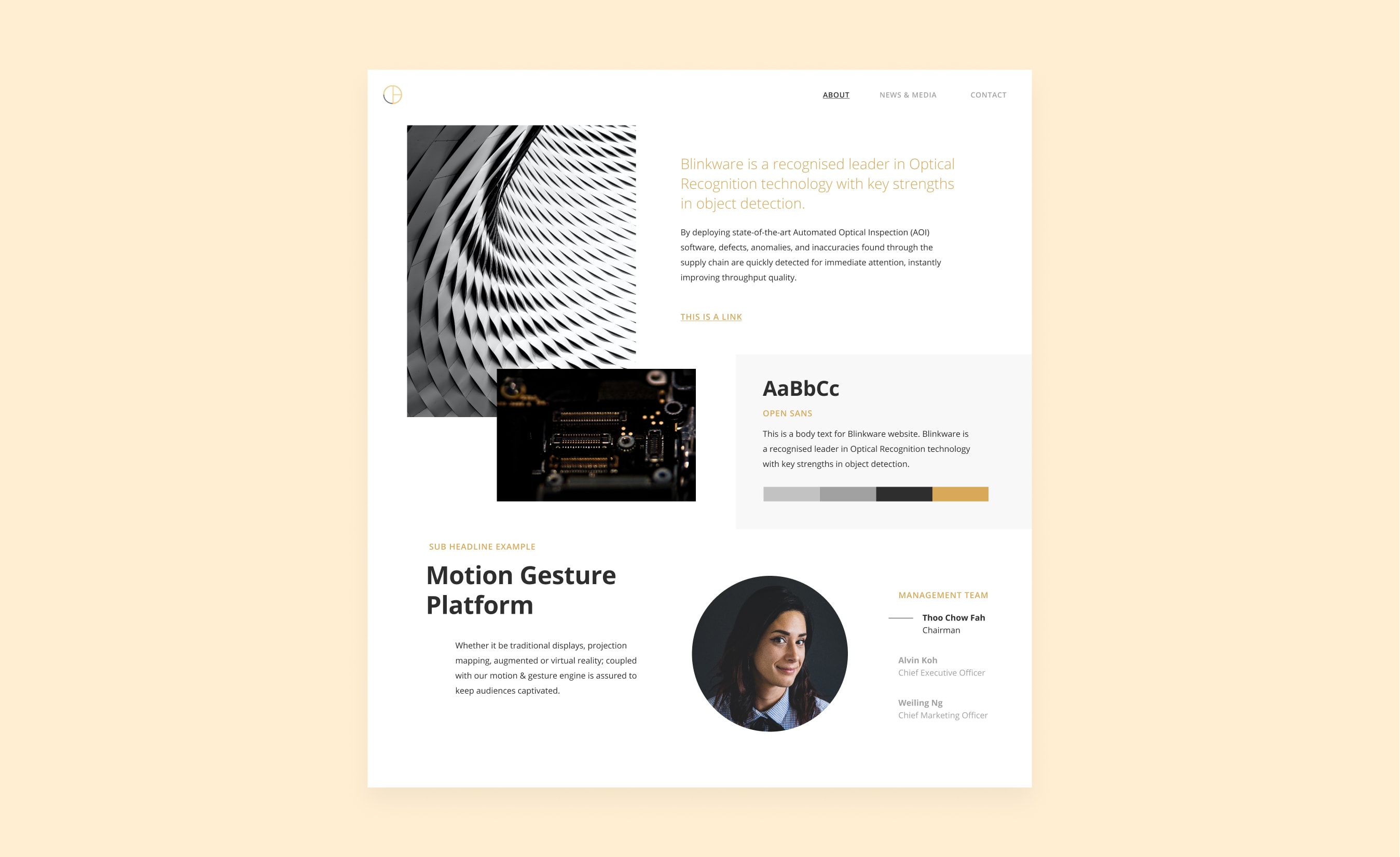
04. Design Language + Style Tile
The new logo has an advance and sleek feel to it. Hence, the art direction needed to fit and translate those core values into the visual.
The simplicity and legibility of "Open Sans" font made it a great fit, not just for Blinkware's website. The same thing goes for its other marketing channels, including printed content. I also kept the focus on using only one brand color with black and white monochrome to be as clean as possible.
A Style Tile serves as a synthesizing document of the brand ideas and inspirations gathered, incorporating visual elements that guide the UI design process
05. Final Design
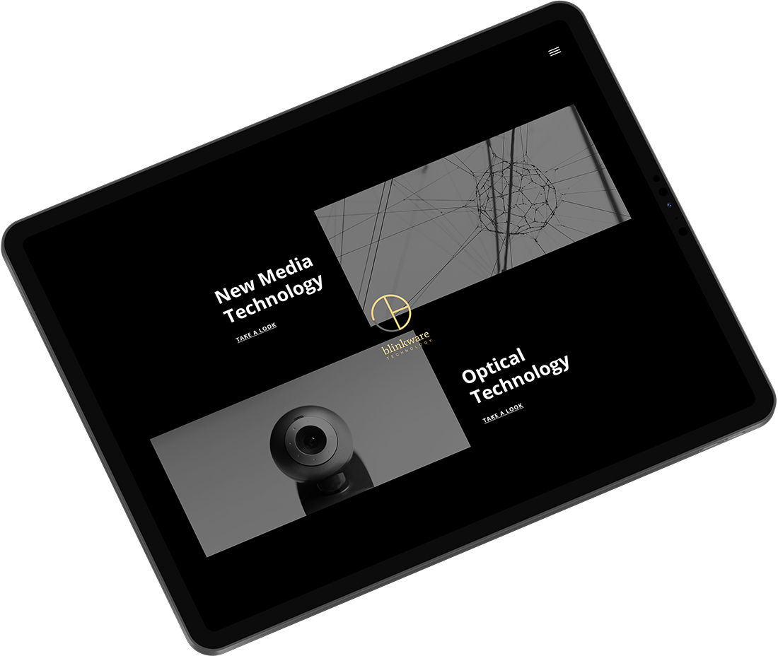
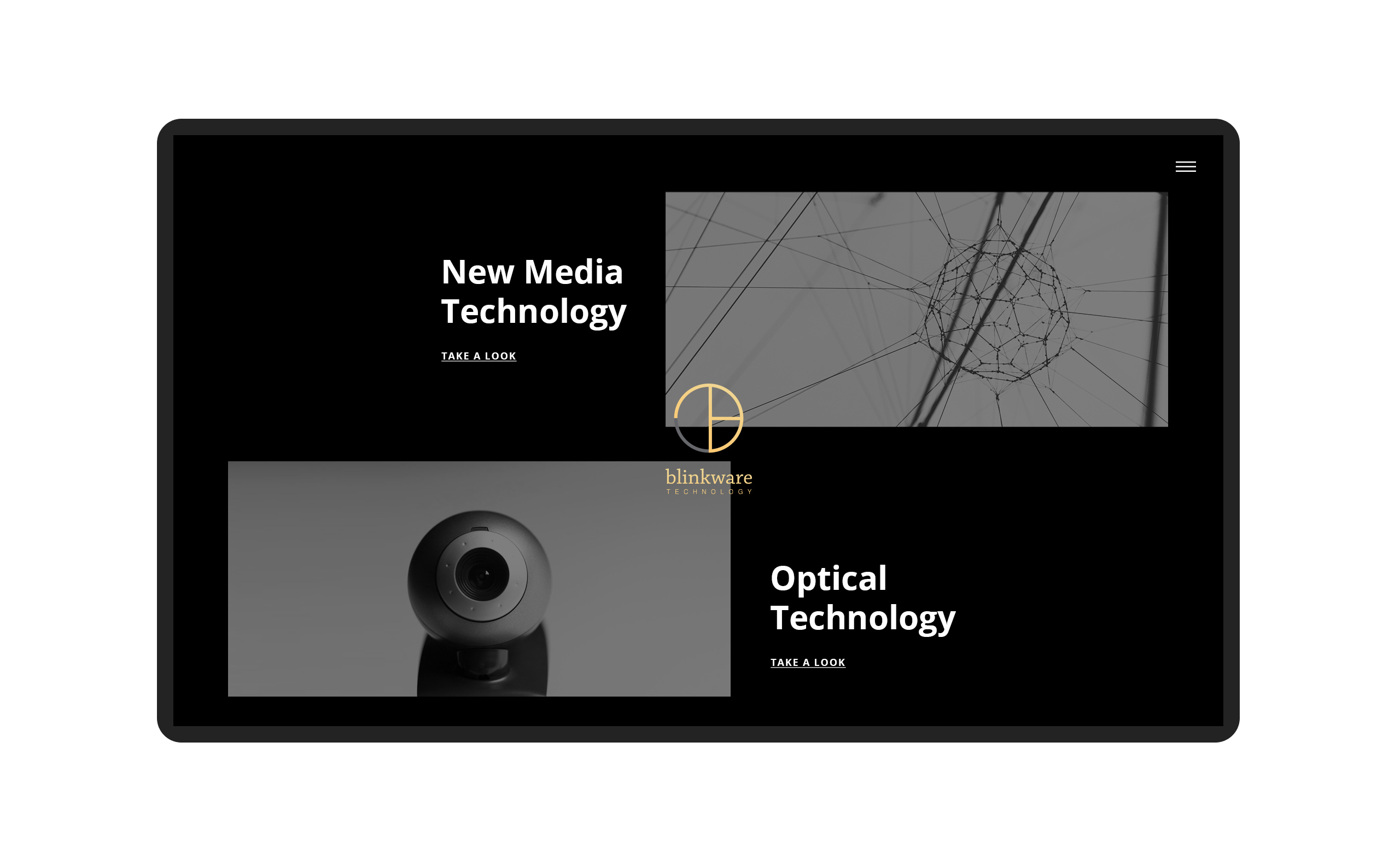
A split screen design was implemented on the homepage to highlight Blinkware's two product value propositions. While the approach gave equal importance to both products, it allowed the user to choose between them quickly at the same time.
Home page
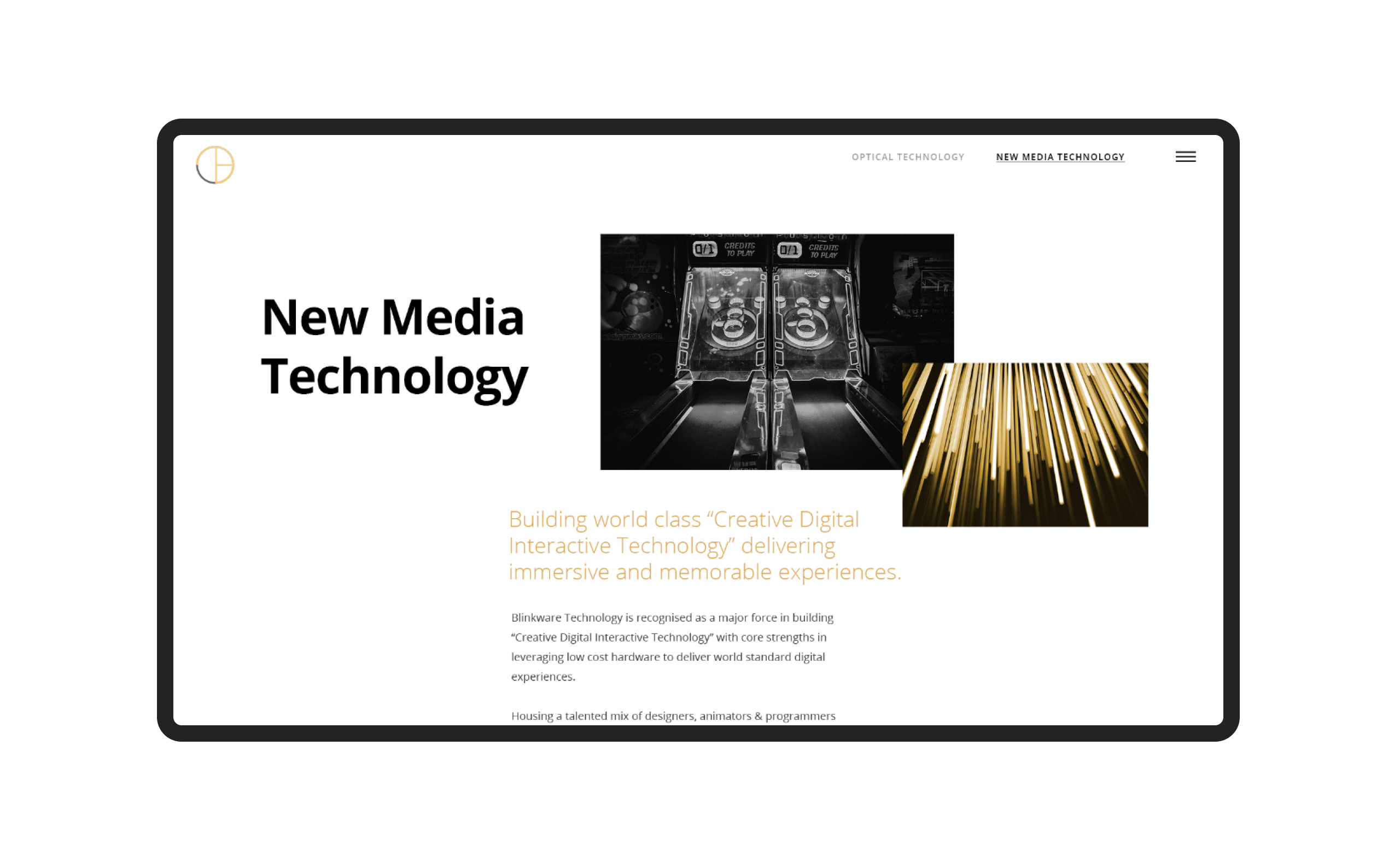
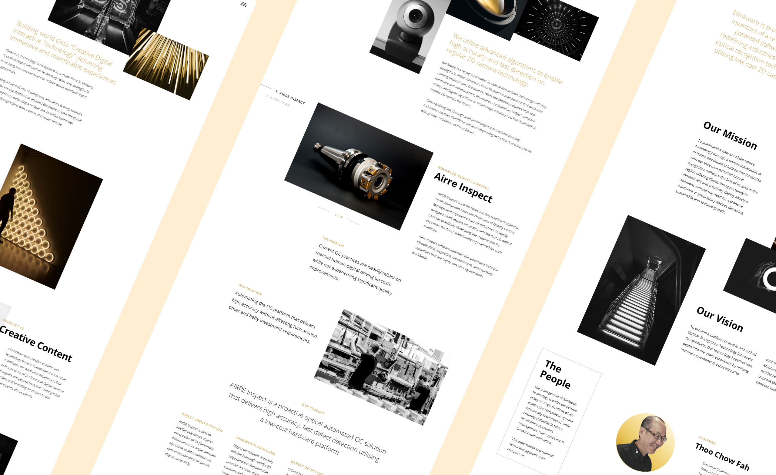
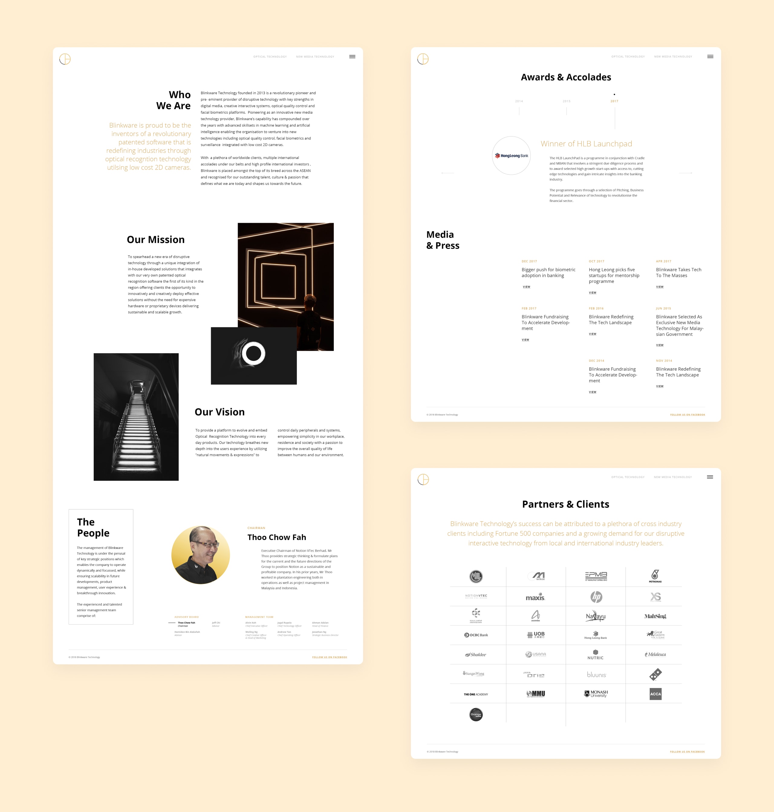
To keep the long-form content easy to read, I used a large focus on imagery and typography to create hierarchies and clarity. I applied plenty of negative space to balance the ratio of image and text.
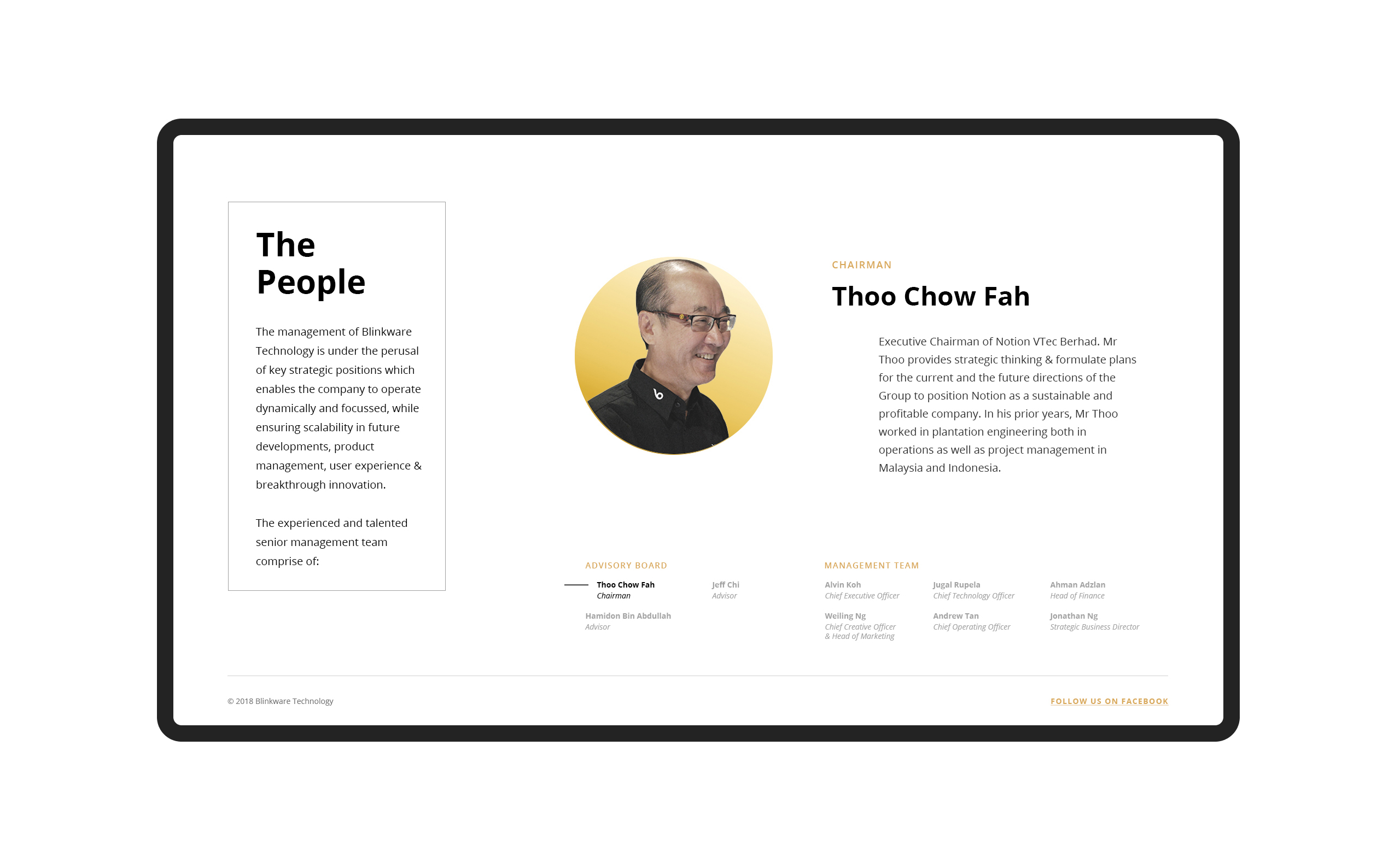
Throughout the website, social proofs like case studies, testimonials, awards, and accolades can be seen, which helped to boost and gain client trust.
About Us, Award & Accolades and Partners & Clients page.
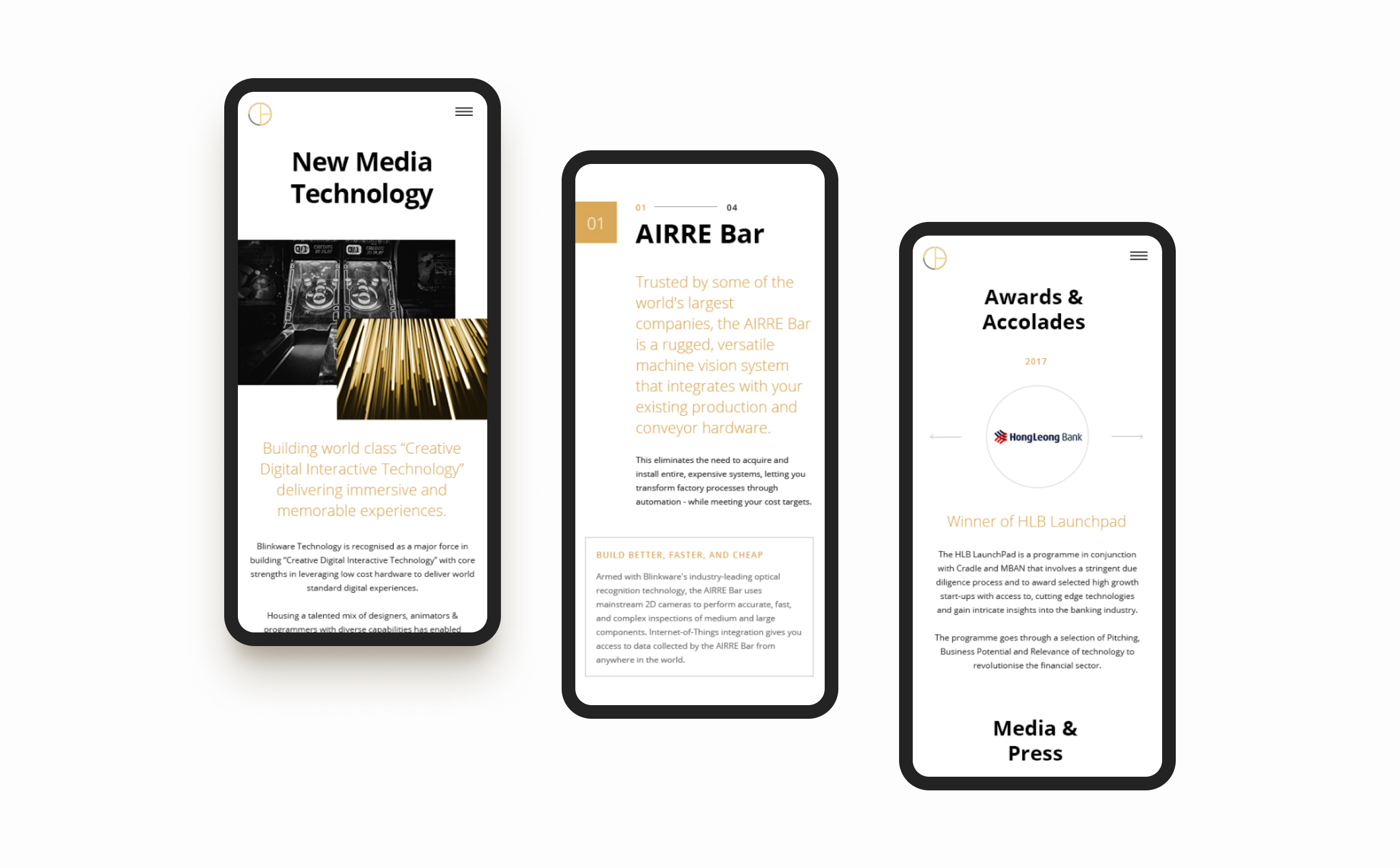
06. Importance of Mobile Experience
For websites these days, needless to say, the number of visitors coming from handheld devices is enormous. I made sure the mobile experience was as good as the desktop one.
07. Development
I proposed to build the site with a website builder - Adobe Muse. The outcome with the builder wasn't entirely satisfactory. It fell short of web responsiveness. To fix this, I exported the code and fine-tuned it by editing it with a text editor, ensuring the site looked good across all devices.