Dunhill is a cigarette brand looking to highlight its recent release of new packaging through a unique digital experience. The app designs focused on communicating the new look through a gamified experience.
How might we help familiarize the shopper with the new packaging so that their experience is favorable no matter which version they purchase?
No items found.
No items found.
01. Design Solution
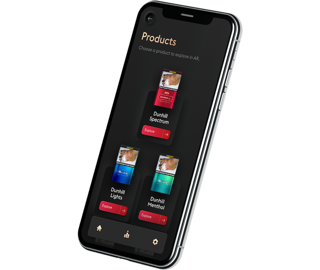
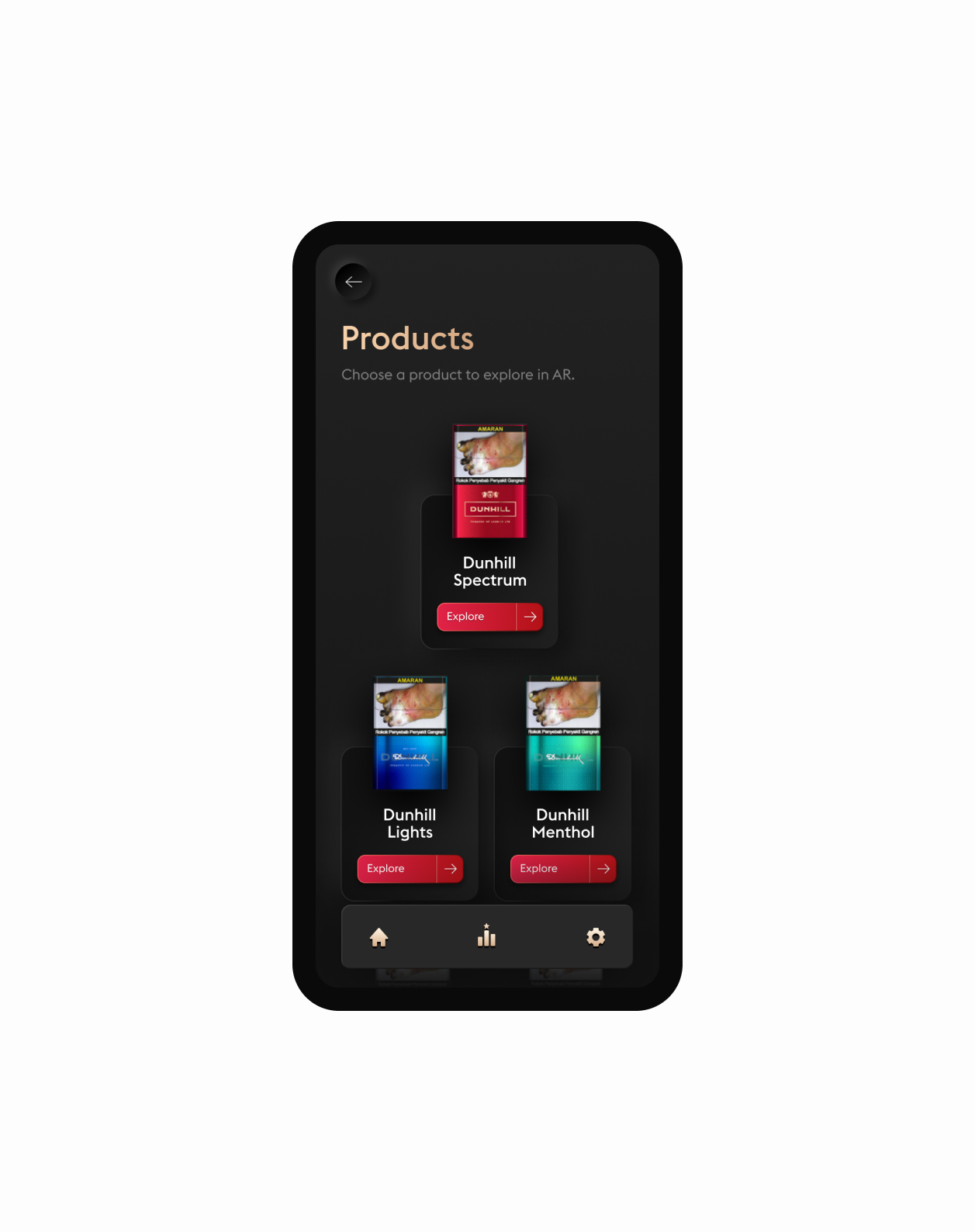
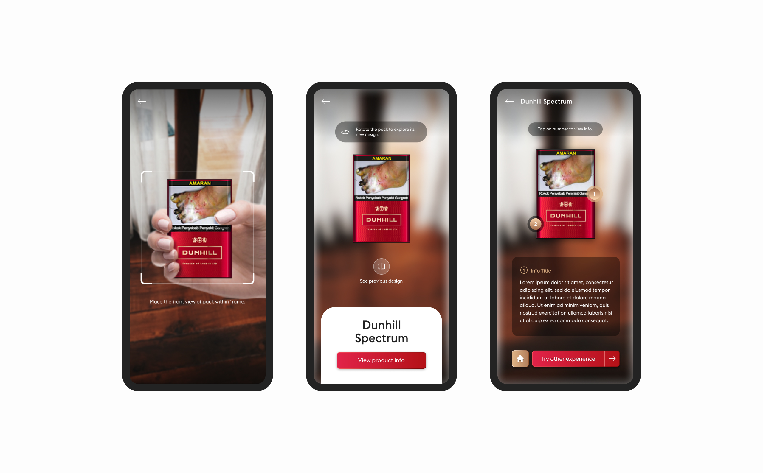
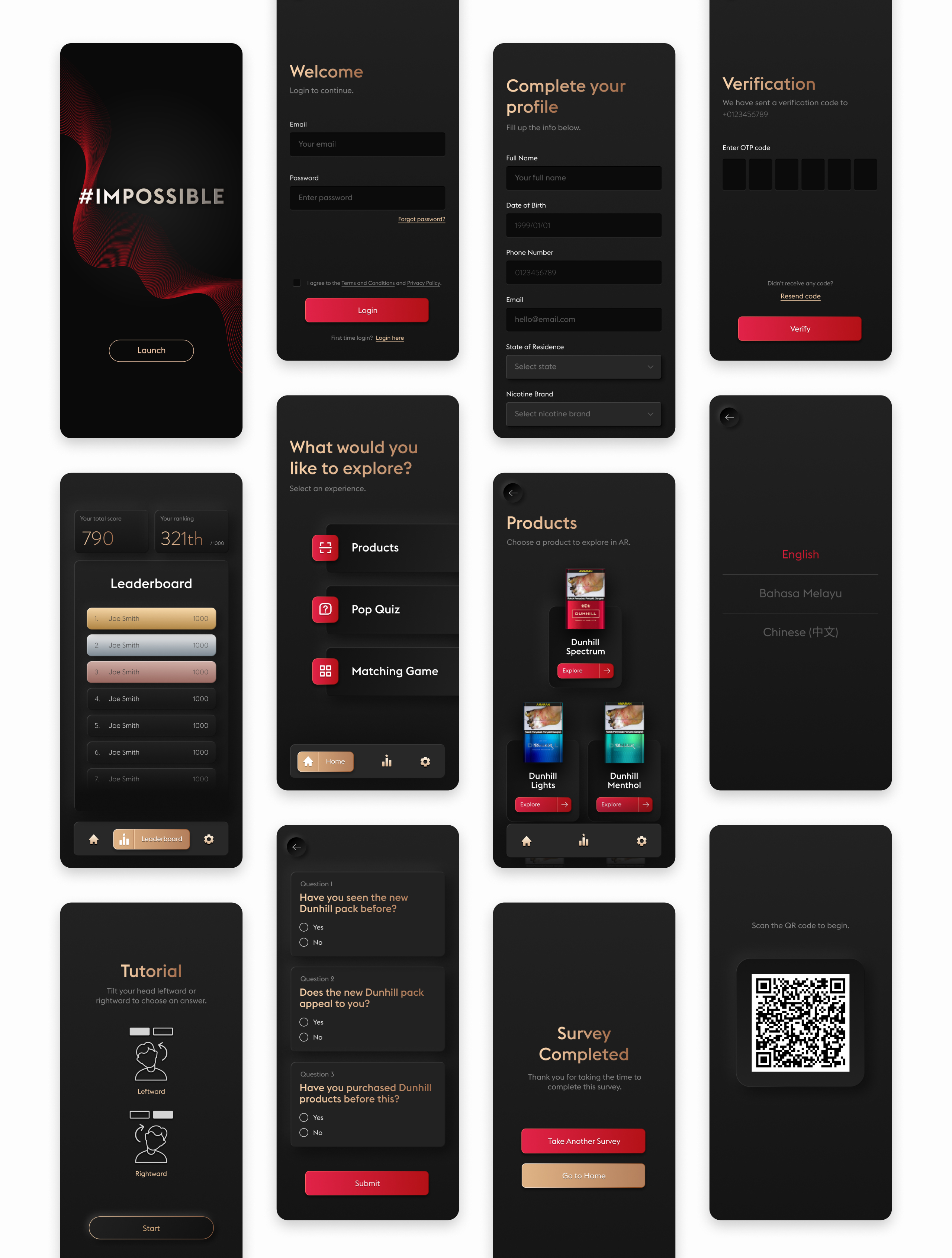
To target the problem, we proposed using Augmented Reality to spotlight the changes for users to compare the packaging differences by scanning the product with a mobile camera. This way, it also helps the product increase its shelf visibility to drive more sales.
User flow of AR functionality
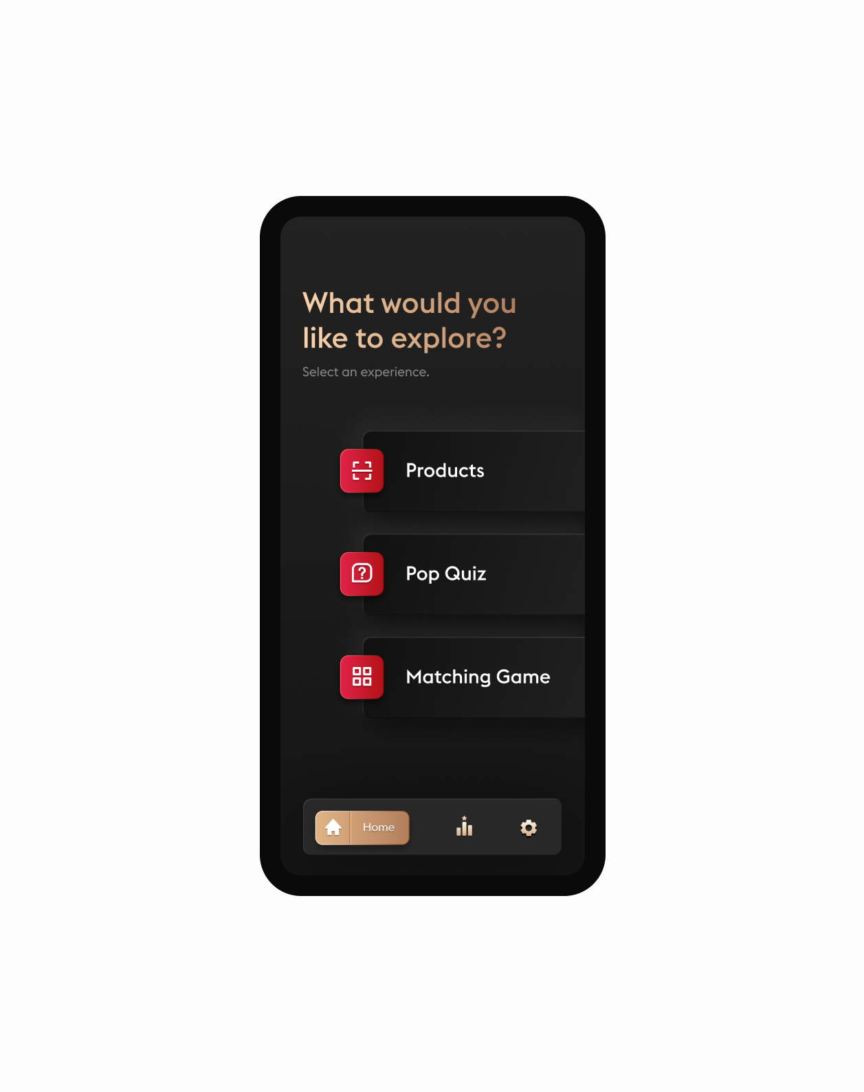
To further leverage this opportunity and communicate the transitions, 2 simple mini-games were implemented to elevate customer engagement.
Matching Game - find the matching cigaratte packs
Pop Quiz - answer questions on the subjet of Dunhill's new packaging
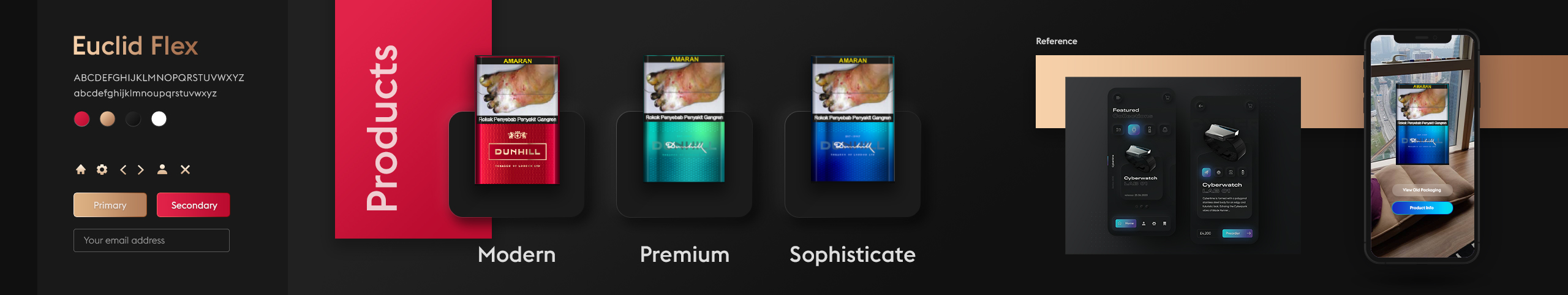
02. Visual Direction
After searching for inspiration, I chose neumorphism to be the main visual. It matches the brand's tone of voice and helps to voice effectively in a way that feels modern, premium, and sophisticated. To get the client a clear picture of where the design direction is heading, I presented the visual direction using Stylescape. Stylescape helps to envision a project's visual direction. It ensures a crystal-clear confirmation that the client and I are on the same page and avoids unnecessary processes before I start the design phase.
Stylescapes are a carefully collected combination of images, typography, and colors to communicate on the look and feel of a design project
03. UI Considerations
Considering the web app isn't text heavy, and users will likely be interfacing with the platform during nighttime, dark UI was adopted for a more comfortable viewing experience.
One thing to note is that while neumorphic design looks aesthetically pleasing, the low contrast ratio can lead to an accessibility issue. Hence, I chose not to have implemented the style in its entirety. I made a tweak by mixing with gradient style to keep all the elements with high enough contrast, ensuring the UI is still usable.
04. Development
Another role I played in this project was visual developer - translating the designs I've created into pixel-perfect front end.
Given the span of a week, I built the front-end using Bootstrap framework to fasten up the development pace. It enabled me to quickly set up the site skeleton and save time for component styling. To work efficiently with the engineer, we used GitHub to synchronize all the written codes, ensuring both sides merged the work correctly.